
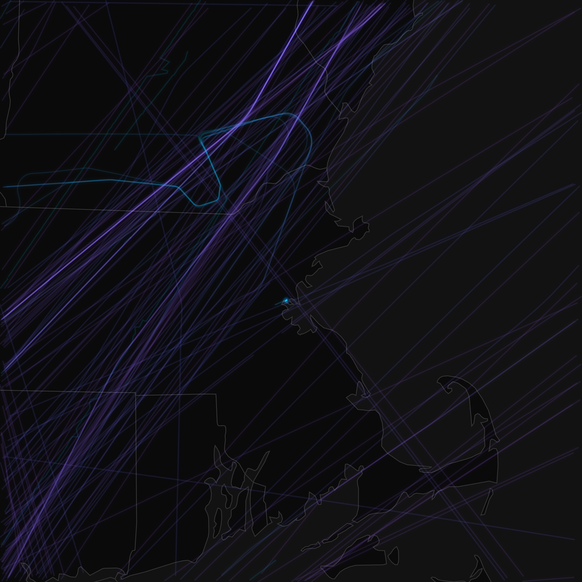
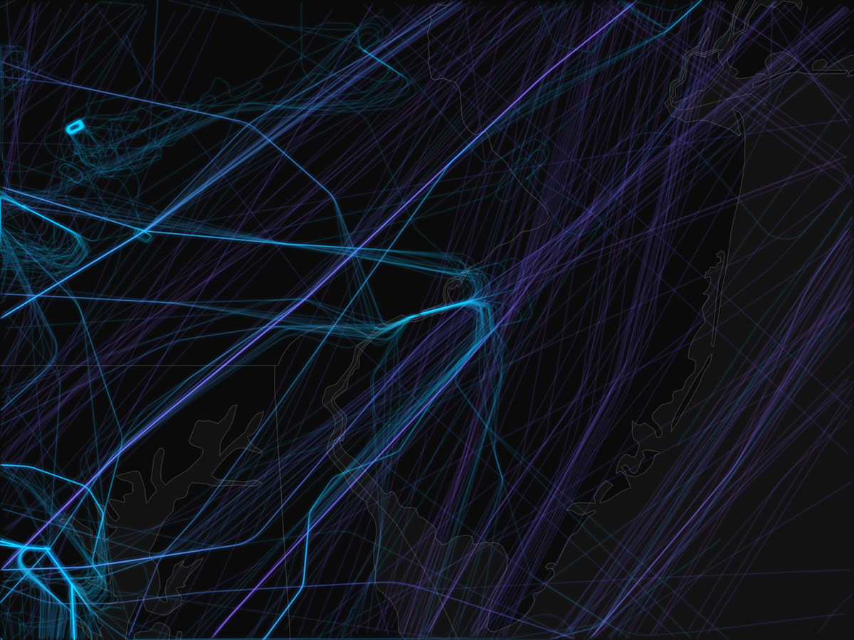
On February 23, 2026, the airspace over New York and Boston was nearly empty. A handful of paths trace through the region, mostly long-haul jets at cruise altitude transiting without descending, while the western half of the same corridor, over the Ohio Valley and Great Lakes, remained active. Winter Storm Hernando didn't stop at the Appalachians, but its worst effects did. The disruption was concentrated almost entirely in the Northeast, and the geography of it is visible in a single day's worth of flight data.
ADS-B tracking data across four metropolitan regions quantifies what that picture shows: New York City recorded an 83.2% reduction in flight legs, Boston fell 82.8%, and both metros lost 90% of their total airborne hours in a single day.
A Gradient Traced in Cancellations
The side-by-side corridor visualization makes the storm's geographic boundary visible as a gradient. The northern metros, Boston and New York, are nearly empty. Philadelphia shows some activity, thinned considerably from the prior day. The D.C. region, at the bottom of the frame, looks comparatively normal.


The New York pair is the starkest. On February 22, the metro is dense with overlapping paths fanning out from JFK, LGA, and EWR in every direction. On February 23, most of those paths are gone. What remains are a small number of long arching routes passing through the region at altitude: aircraft that didn't land. New York's total airborne hours fell from 875.6 to 85.7, a 90.2% reduction.
Washington D.C.'s image tells the opposite story. The metro retained 995 unique aircraft on February 23 versus 1,527 the prior day, and average leg duration barely shifted, from 24.1 minutes to 23.7. The paths in D.C.'s February 23 frame look much like the day before: terminal traffic, approach corridors, the familiar shape of a functioning multi-airport hub.
The Altitude Inversion
The sharpest visual change shows up when comparing the color character of the Boston and New York storm-day images against their baselines. The altitude-based color gradient shifts markedly on February 23: the dense mix of low and mid-altitude approach paths that characterize a normal day's terminal traffic is replaced almost entirely by high-altitude cruise paths.
The data confirms what the color shift shows. In New York, the 10,000-20,000 foot band, the approach and departure zone for JFK, LGA, and EWR, collapsed from 535 legs to just 20, a 96.3% reduction. Meanwhile, the 30,000-40,000 foot cruise band fell at a much lower rate (68.1%), shifting from 28.5% of all traffic to 54.1% of the much-reduced total. Average cruise altitude in New York rose from 23,953 to 33,325 feet, not because aircraft flew higher but because the low-altitude approaches that anchor a normal average were gone. Boston's average rose even more sharply, from 22,700 to 33,121 feet.

The aircraft still flying in Boston on February 23 were overwhelmingly transiting overhead rather than operating to and from Logan. Average groundspeed climbed from 296 to 451 knots as the fleet composition narrowed to high-altitude jets at cruise.
Washington D.C. inverts this pattern visually and numerically. Average cruise altitude fell from 27,891 to 24,476 feet, and the 10,000-20,000 foot band actually grew in absolute terms as DCA, IAD, and BWI continued processing normal terminal traffic. Where Boston and New York lost their low-altitude paths, D.C. kept them.


Terminal Operations Ceased; Transits Continued
The path shapes visible in the storm-day maps carry operational meaning. On a normal day, metropolitan airspace is filled with short, curved paths: aircraft descending on ILS approaches, climbing out of departure fixes, vectoring in the terminal area. On February 23, those shapes largely disappear from the Boston and New York frames. What replaces them are the long, clean arcs of aircraft at cruise, entering the frame from one side, crossing it, and exiting the other without descending.
Average leg duration quantifies this directly. Boston fell from 26.7 to 15.6 minutes, New York from 21.7 to 12.6 minutes, Philadelphia from 22.3 to 13.5 minutes. Legs under 15 minutes in metropolitan airspace are mostly terminal-area operations or short positioning flights, which points to the medium-haul commercial operations that generate 30 to 90 minute legs having largely fallen away. D.C., by contrast, averaged 23.7 minutes, unchanged from the prior day's 24.1.
Philadelphia's Distinct Disruption Signature
Philadelphia's February 23 image looks different from Boston's and New York's, and the difference is meaningful. Where the northern metros show sparse high-altitude transit paths, Philadelphia's frame retains more low-altitude activity: shorter paths clustered near the airport, consistent with arrivals still completing approaches in deteriorating conditions.

The data supports this reading. Average leg distance in Philadelphia fell from 96.7 to 61.8 nautical miles, the steepest compression of any region studied. Sub-10,000 foot operations rose from 26.0% to 41.6% of remaining traffic. Average cruise altitude increased only 26% compared to 39-46% in New York and Boston. Philadelphia was more disrupted than D.C. but its surviving operations retained a different character (short-range, low-altitude, terminal-adjacent) rather than the high-altitude transit profile that dominated Boston and New York.
The Grounding Asymmetry
Across the storm-core metros, the pattern of which aircraft stopped flying and which new aircraft appeared tells its own story. In New York, 1,326 aircraft flew on February 22 and did not fly on February 23. Only 203 aircraft new to the region's data flew that day, a grounding-to-replacement ratio of 6.5:1. Boston showed approximately 6:1. These new registrations appearing on the storm day were almost certainly the high-altitude transits visible in the maps: aircraft entering the geographic capture area from outside, not originating locally.
Washington D.C.'s ratio was 1.9:1, with 1,143 grounded against 611 new aircraft entering operations. At that proportion, D.C. was experiencing normal fleet rotation at the margins, not a shutdown.
The Aggregate Toll
Across the full storm core, the numbers behind the visual collapse are substantial. The corridor went from 7,513 flight legs on February 22 to 5,533 on February 23. But total distance fell further, from 2,142,863 to 1,253,914 nautical miles (a 41.5% reduction), because the flights that stopped were disproportionately the longer ones. Average leg distance fell from 285.2 to 226.6 nautical miles. Across the storm core, 1,022,985 statute miles of flight distance went unflown.
Methodology
All statistics were derived from publicly available ADS-B (Automatic Dependent Surveillance-Broadcast) position data archived by ground receiver networks. Raw position reports were processed into discrete flight legs (contiguous segments for a single aircraft registration, separated by time gaps or ground contact) and filtered to fixed geographic bounding boxes defined prior to analysis.
February 22, 2026 is the pre-storm baseline; February 23 is the storm day. Estimated cancellation figures are arithmetic differences in leg counts between the two dates, not sourced from airline records. The dataset was filtered to passenger airliner aircraft. General aviation, cargo, charter, and military operations are excluded. Aircraft without ADS-B transponders are not represented.
This analysis is built on ADS-B data. For how that signal works and why every aircraft broadcasts its own position, see What Is ADS-B, and What Problem Does It Solve?.


